In the vibrant world of mobile applications, design is much more than just good looks; it's about usability and accessibility. One of the most critical elements that bridges the gap between the aforementioned aspects is color contrast. Color contrast is very important in making mobile apps interactive and enjoyable to all users, including those with visual impairments.
We will discuss the importance of color contrast, its influence on users with visual impairments, and provide practical tools and guidelines to designers to help them in their work of designing mobile applications.
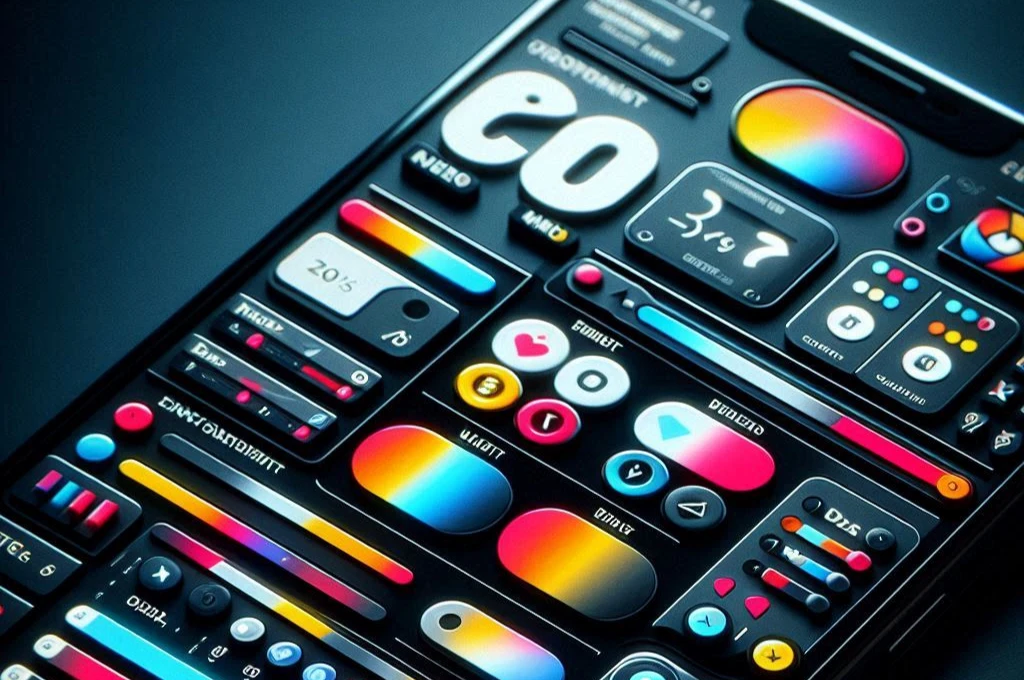
Color Contrast Understanding
Color contrast is the difference in luminance or color that provides an object with the property of being distinguishable from its surroundings. Good color contrast makes the text and other important elements pop, thus making the interface more readable and navigable.
The human eye sees color through the light receptors in the cones sensitive to different wavelengths of light. Color contrast is helpful for the distinction of objects, especially when people suffer from color vision deficiencies or any other visual impairments.
Importance of Color Contrast for Visually Impaired Users
Visual disabilities range from color blindness through low vision to complete blindness. A person who is color blind may have difficulty distinguishing certain color combinations. A person with low vision may have difficulty reading text unless it is in high contrast.
High color contrast is the ability to view content, irrelevant to one's visual capabilities. The consequences are not just a more powerful user experience, but also giving a plus toward the principle of inclusivity.
Strategies to Ensure Adequate Color Contrast
Color Contrast Checking Tools
There are a number of devices that can be used by designers in order to test and improve the color contrast within their mobile applications. The following are some of the more frequently used devices:
Contrast Checker: Tools like the WebAIM Contrast Checker allow designers to input foreground and background colors and determine their contrast ratio. This helps ensure compliance with accessibility standards such as WCAG.
Colorblind Simulators: Tools like Color Oracle simulate how colorblind users perceive your design. This can help designers avoid problematic color combinations and ensure that content is accessible to users with different types of color blindness.
Accessibility Extensions: Brower extensions, such as the Axe Accessibility Checker or WAVE Evaluation Tool, are available that can provide real-time feedback about color contrast issues in web pages and mobile app designs.
Figma Plugins: Figa has different plugins which may help a designer in checking the color contrast and ensuring accessibility. Some of the commonly used plugins are:
- Contrast: This plugin helps designers make sure their choices of color meet guidelines from WCAG by providing real-time calculations of contrast ratio.
- Able: helps designers check their designs against accessibility standards and provides suggestions to improve them.
- Color Contrast Checker: A lightweight plugin that allows designers to test the contrast ratio of their color picks directly inside Figma.
Guidelines and Best Practices
Following are some guidelines and best practices to help achieve and maintain optimal color contrast in mobile UX design:
Follow the WCAG Guidelines: Web Content Accessibility Guidelines or WCAG is some overall recommendations for accessibility. The minimum contrast ratio has to be 4.5:1 for normal text and 3:1 for large text so that text is readable by visually impaired users.
High Contrast Colours: Avail of colours that provide high contrast. Of course, the classic example is black text on a white background; however there are a lot of other combinations that can work. Tools like the Adobe Color Contrast Analyzer can help you identify suitable color pairs.
Avoid Problematic Color Combinations: Be very leery about using problematic color combinations that are bar to distinguish - like red and green, or blue and purple. Add a texture, pattern, and/or shape to increase understanding of both color and noncolor users.
Usability testing with real users: involves conducting usability tests across diverse groups, even including those that may have vision loss, so that one receives feedback regarding real-world scenarios about one's design performance.
Iterate and Improve: Accessibility is a process that never stops. Gather feedback from users, and keep improving with your design. Make use of analytics and user test data to find out where the contrast is poor and fix those areas immediately.
Educate Your Team: Make sure the people who are designing and developing your products are informed about color contrast and accessibility. Give your team training and resources to create more accessible designs.
Document and Share Best Practices: Create a style guide or design system that contains color contrast guidelines. Share this with your team and stakeholders to ensure consistency across all projects.
By taking advantage of these tools and following best practices, one can create accessible and enjoyable mobile applications for all users independently of their visual capabilities. This will improve the user experience and also include inclusive design to make your app more user-friendly and compliant with accessibility standards.
Color Contrast in Mobile UX Design
Color contrast is pretty important in every design aspect for ensuring readability of text, showing buttons and elements which users can actually interact with, and enhancing usability. Here's a real example of mobile applications using color contrast effectively:
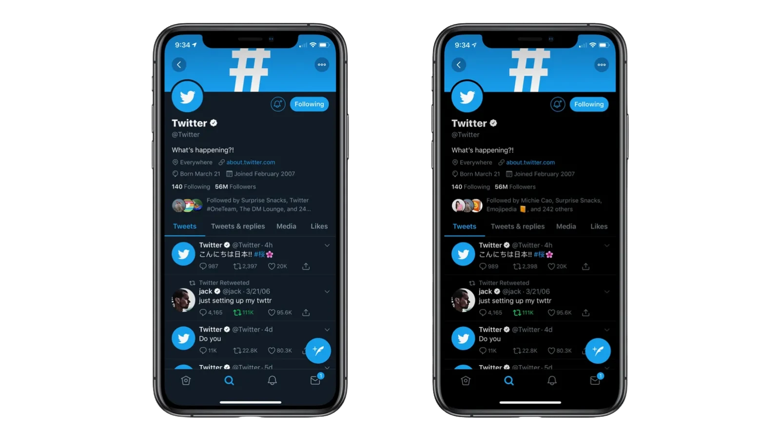
Twitter is well-known for its minimalist design, featuring high-contrast text against a clean and simple background. Our dark mode design uses light text in the foreground over a dark background to make it easier for users to read the content of the app in low-light conditions.
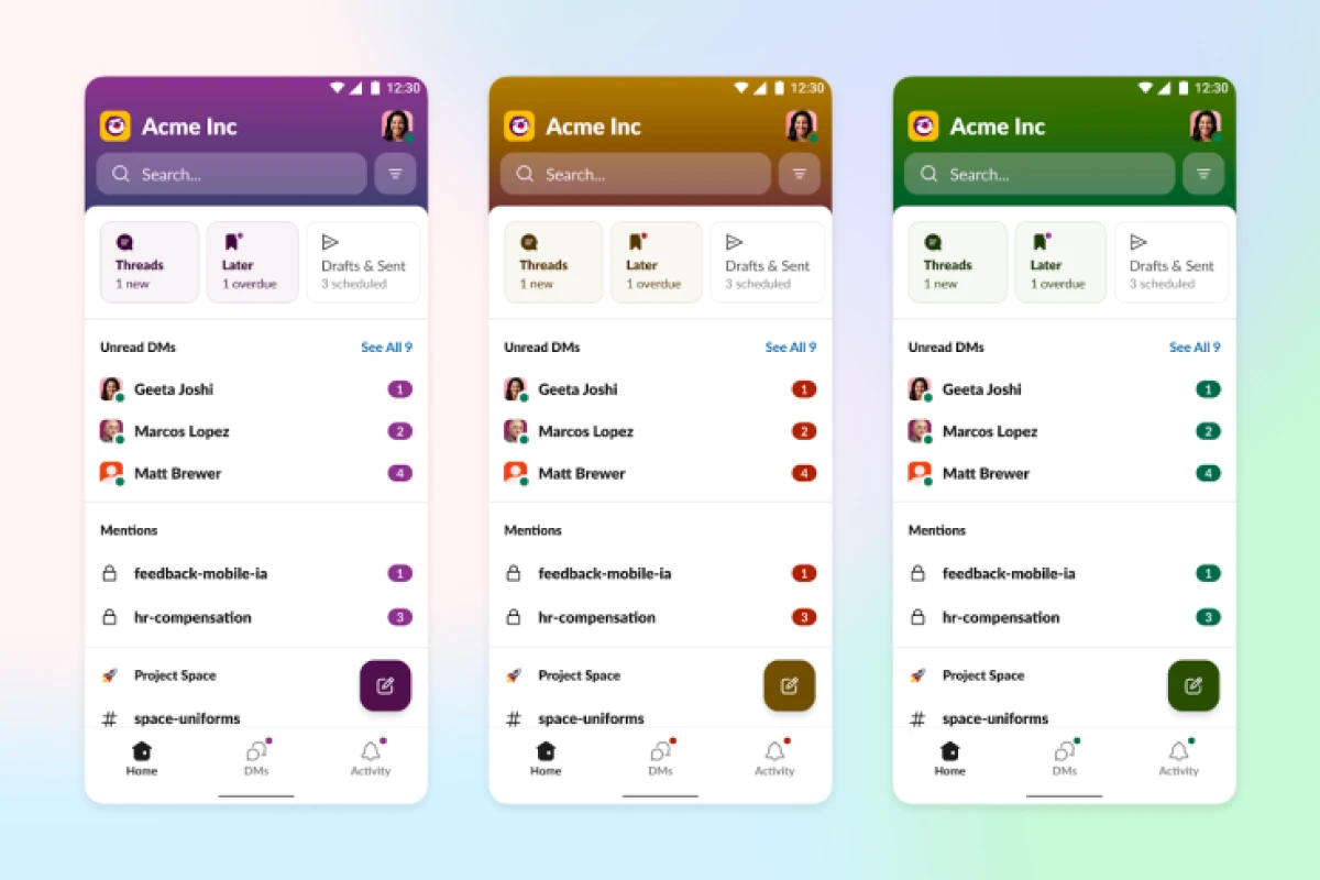
Slack
Slack provides themed support out of the box, including high-contrast options to make things more readable for vision-impaired users. By providing different themes, Slack enables users to use whatever color schemes they feel are most appropriate for their needs, creating a more inclusive experience.
Instagram Instagram's design is full of highly contrasted elements: for example, the profile page and notifications have white text on black. It increases readability of text, and all key information attracts your attention.
Conclusion
In summary, color contrast is a fundamental aspect of mobile UX design that significantly impacts readability and accessibility. By understanding the science behind color perception, leveraging appropriate tools, and adhering to best practices, designers can create inclusive and user-friendly mobile applications.
UX designers, it's our responsibility to prioritize accessibility in our projects. Let's commit to making thoughtful color choices that enhance the user experience for everyone.
Additional Resources
Further Reading For more information on color contrast and accessibility, consider exploring:
- "The A11Y Project": A community-driven effort to make web accessibility easier.
- "Inclusive Design for a Digital World" by Regine M. Gilbert: A comprehensive guide to designing accessible digital experiences.