If there’s one reason I keep enjoying UX, it’s this: every project feels like a new quest. There’s a challenge, a twist, a “wait… that’s interesting” moment, and sometimes a “why is it like this?” moment too.
I used to think UX was mostly about making things look clean and polished. But over time, I realized UX is often about understanding people. Deep dive into their habits, needs, worries, and how they make decisions (even when they can’t fully explain them).
One of the most memorable experiences for me was working on a case related to a car diagnostic tool for Mercedes-Benz mechanics. It was fast-paced, high-stakes, and very real. The users needed a tool that truly supported their workflow—something that reduced friction, not added to it. That experience left me with lessons I still carry into new projects today.
In this post, I’m sharing a few of those lessons—plus a couple that surprisingly came from everyday experiences as a product user.
Bias is Sneaky and It Show Up Quietly
Once I started doing more UX research, I realized bias isn’t some distant concept. It can slip in through small choices—who we talk to, how we frame questions, and how we interpret what we hear.
A few habits that have helped me:
- Talk to a diverse range of users, not just the easiest ones to reach
- Keep questions neutral (it’s surprisingly easy to lead people)
- Patience and listen longer because an insights often show up after a pause
- Double-check my own assumptions: “Is this a real finding, or just my preference?”
To me, UX research feels like detective work. You’re trying to get closer to what’s true, not chasing the answer you want.
Personas & 5W: Turning “Users” into Real People
In a few projects, I created personas—one of them I called Alex, a tech-savvy professional who expects digital experiences to be clear and fast. For me, personas aren’t just pretty slides. They help keep the team grounded: we’re designing for real people, not abstract “users.”
To structure problem discovery, I often use the 5W framework (What, Who, When, Where, Why). It’s simple, but powerful:
- What exactly is the problem?
- Who is affected?
- When and where does it happen?
- Why does it matter?
It keeps discussions focused and design decisions more defensible than “it just feels right.”
"Payment Failed" Triggers Anxiety
Some UX lessons come from everyday life. Take this example: when a digital wallet says “payment failed.”
From a technical perspective, it is an error state. But from a user perspective, it can quickly go down a rabbit hole of “what ifs.”
- Was I charged or was I not?
- If I was indeed charged, when will the system reverse the charge?
- Should I retry or wait?
- And if I do retry, will I end up being double-charged?
This was the epiphany for me. UX is more about the flow, it is also about the emotional certainty of the user. Some of the issues in UX are not because the user cannot click the button but because the user does not feel in control of the situation.
In fast-paced working environments like those around Mercedes-Benz mechanics, uncertainty really does become a productivity killer. Clarity does matter.
Ideation & Prototyping: The Fun Part—But It Can’t Run on Vibes Alone
I love ideation. It’s where ideas get messy and fun. But I’ve learned that the “coolest” idea isn’t necessarily the “best.”
In a finance tracking project, a better pace might look like this:
- Generate many ideas (no judgment)
- Filter ideas based on actual user needs
- Build a realistic-enough prototype
- Test
- Repeat
The best part? Users often teach you something you didn’t see coming. And that isn’t discouraging—it’s just the job.
The Mercedes-Benz Registration Form: Trust Lives in Small Details
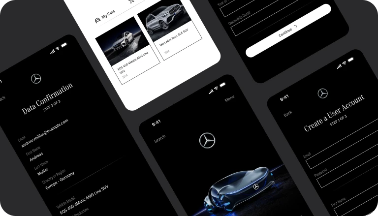
In the “Building a Register Form for Mercedes-Benz” project, the objective appeared to be simple: a registration form. But forms are like the front door to a house: users are invited to open up and share their information. They also determine whether the product feels trustworthy.
My focus was on three key areas:
- Reduce friction: ask only what’s necessary
- Build trust: helpful validation, human error messages
- Maintain professionalism: UI that looks and feels professional
The end goal was not “Users can sign up.” It was “Users feel comfortable continuing.”
Closing: UX Always Returns to Empathy and Iteration
If I had to boil it down to one sentence: UX design is like a never-ending cycle around two constants:
- Empathy: understanding humans and their world
- Iteration: testing, learning, and doing it again
Good products aren’t built in one try. They often require a series of attempts and learning experiences. Maybe that’s why UX feels like a never-ending quest: every project has a new story—and leaves you with something worth bringing to the next one.